DBS Bank design systems
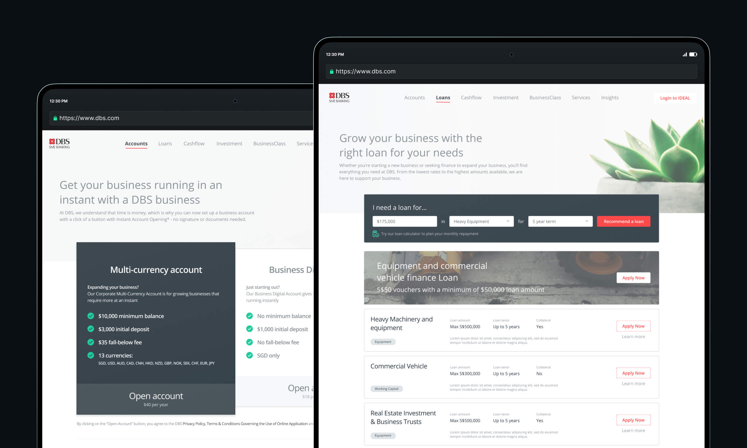
At DBS Bank, I was in charge of the SME Design System, collaborating with the Consumer and Enterprise banking teams, led by Bady and Ruoxi respectively. Many components overlapped, but due to differing requirements and limitations in Figma at the time, we maintained three separate systems for each vertical.
Color systems
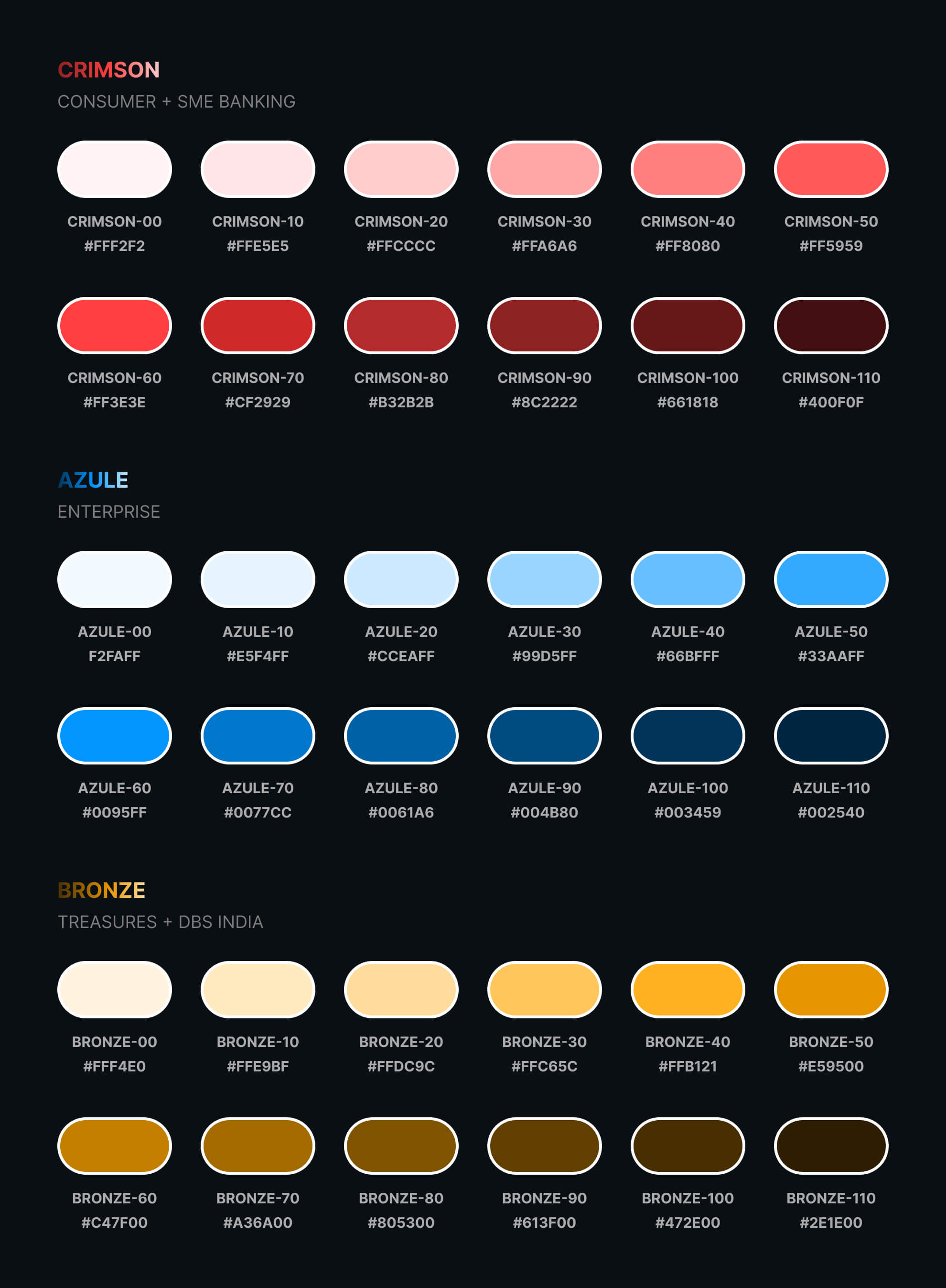
My first task was to create a color system that could be applied across all verticals. I focused on accessibility and making it easy to swap colors without worrying about contrast.
The bank’s signature red did not meet accessibility standards, and changing it organization-wide was not possible. We did, however, slightly darken the hex values for products. The difference is unnoticable to the untrained eye, but it improved accessibility, though not fully passing standards.
To alleviate this issue, as accessibility become more practiced in the organization, we introduced a high contrast mode which would adjust all colors to meet accessibility needs, regardless of brand requirements.
Communicating best practices
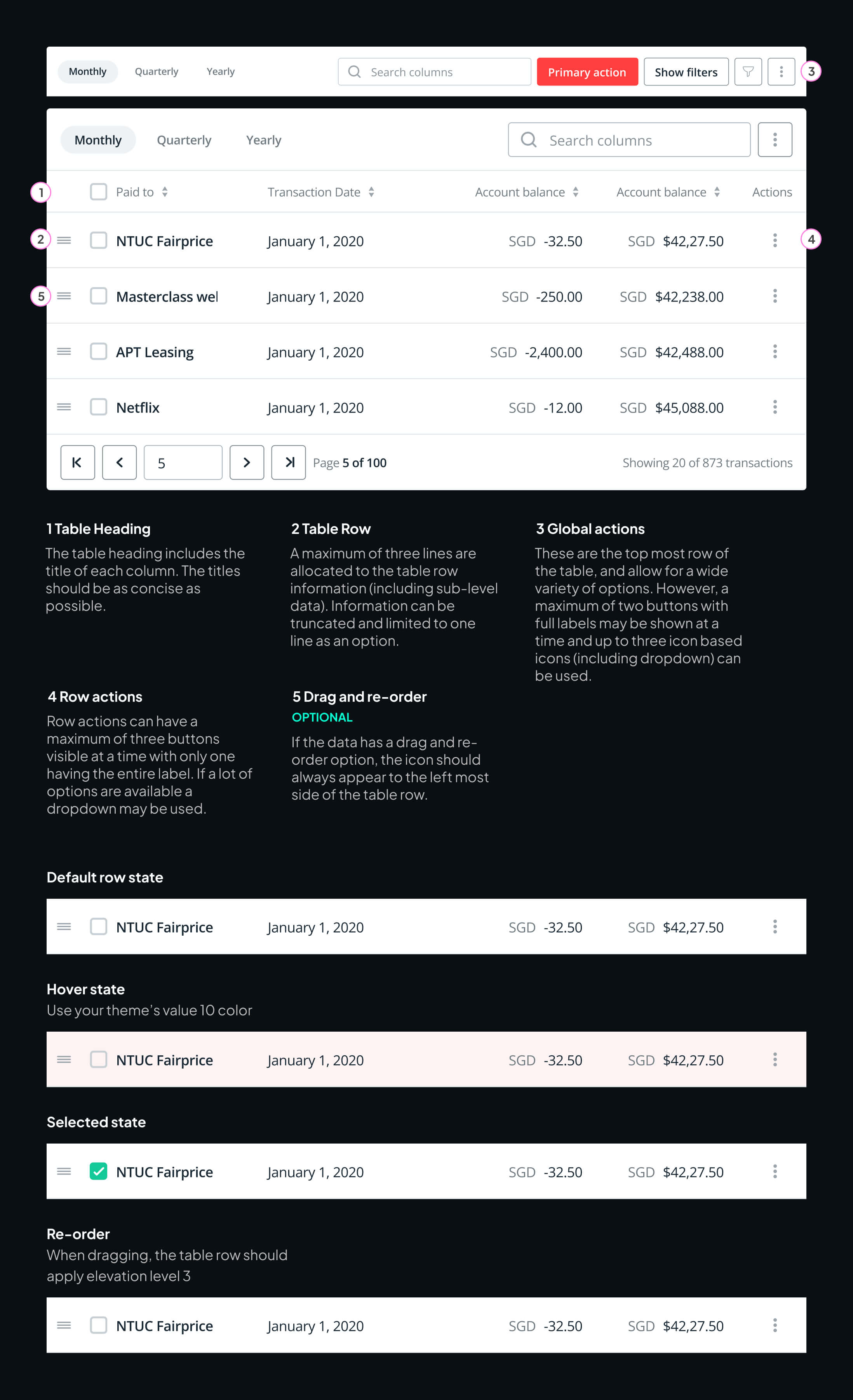
Documentation is critical in any design system we build, but one discovery made was that designers weren’t always reading it. Repeated questions in Slack about components proved this was true and something that needed to be addressed.
I also built a simple response Slackbot that automatically responds to specific queries with links to component documentation. This method allowed us to politely remind our design team to review the guidelines we had put in place, before asking questions. The result was reduced questions, but also helped us better identify areas of improvement in the documentation.
Communication through onboarding
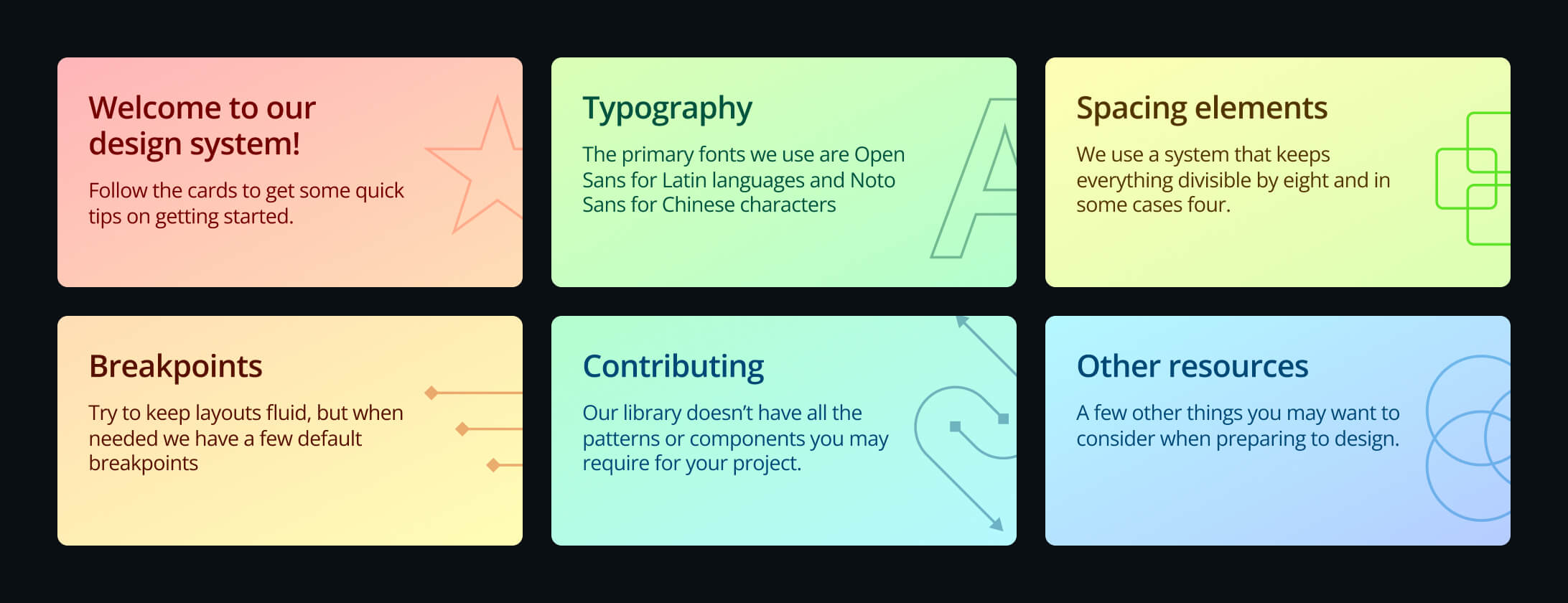
As our team grew to over 70 designers, onboarding needed to be engaging and accessible. The first page of the design system file featured cards introducing design principles and linking to resources.
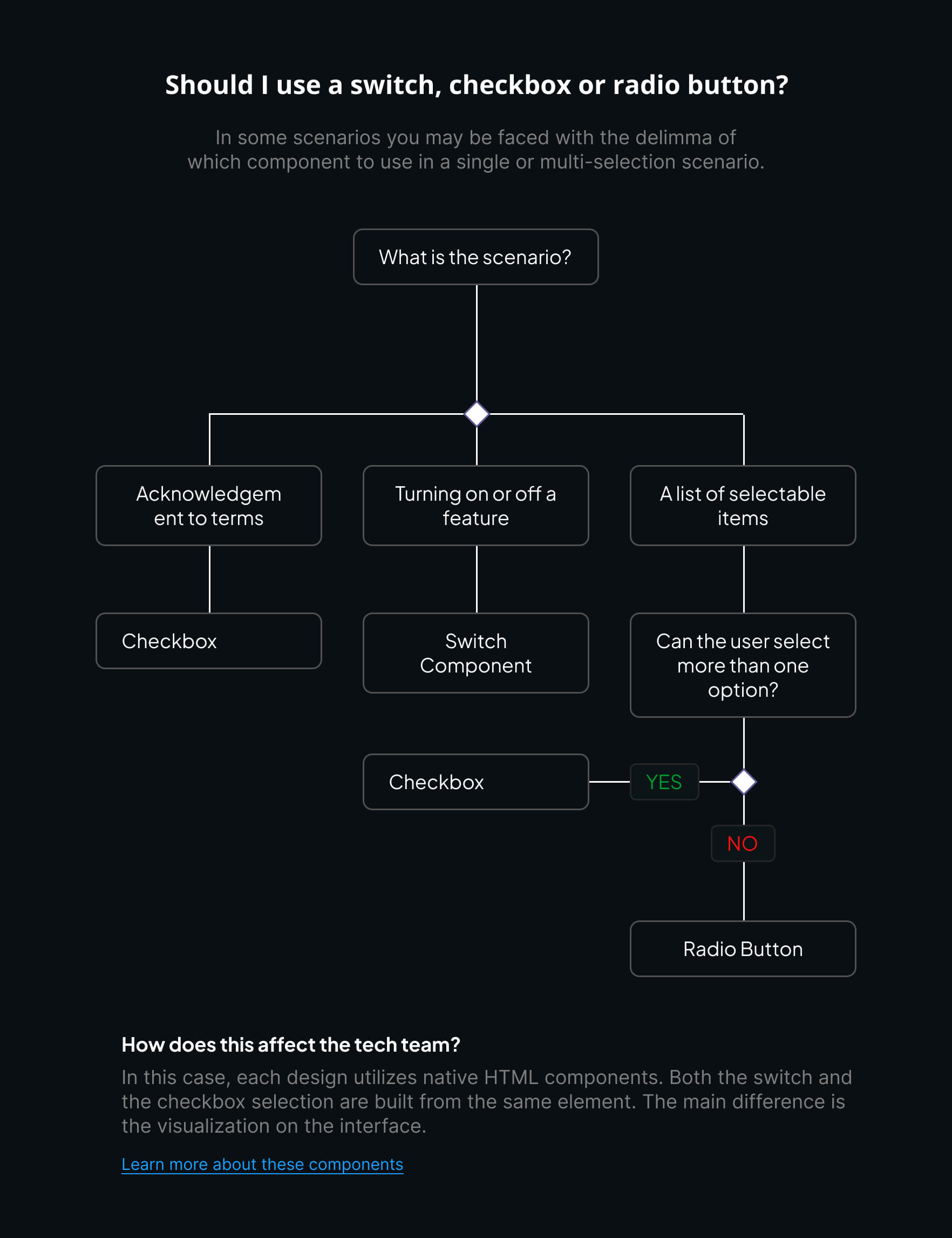
Another area Ruoxi and I took on was building decision trees to guide designers in choosing the best component for their needs. Our goal wasn't to tell people what to use, but also bring in an educational element about development requirements and accessibility considerations where applicable.
Accessibility
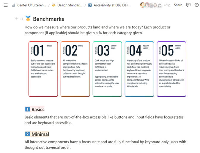
I was tasked to lead the accessibility adoption program across all verticals. Convincing stakeholders was challenging, some argued only a small percentage of users required accessibility; but by referencing up and coming government requirements in Singapore and Hong Kong, as well as user needs in markets we serve like Vietnam, we started to make our case.
Working with my manager Leo, he knew the Managing Director for the Engineering team was a tough cookie to crack. So he suggested we frame accessibility as a driver for quality product design and development. The demo we put together simulated a blind users' experience. We hid our entire website behind a black screen. Only as you started to tab through the page, elements that were in focus would become visible. This demo not only was a powerful visualization, but it revealed that over 35 hidden elements on the page existed before the first tab even reaches the first visible element. This highlighted the need for a more robust and structured page layout.
The cookie cracked. Shortly after, we gained a part time resource to help begin implementing accessibility into the core developer components.
Final note
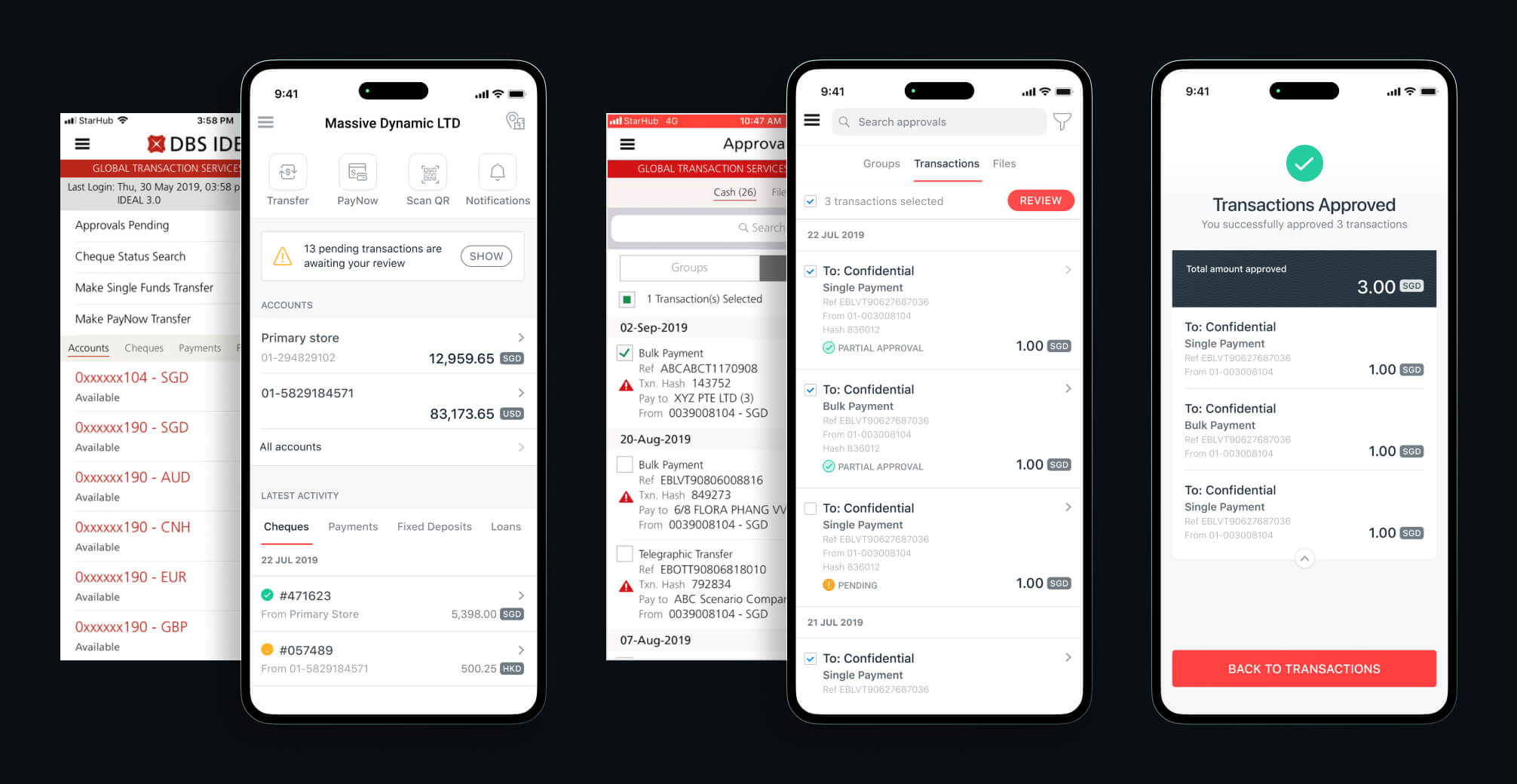
As our design system matured and the adoption improved across all verticals and teams, Applications and websites quickly began to feel apart of a single family. The consistent guidance, onboarding, and accessibility practices and discussions aided in creating a unified and more effective design culture whereby teams outside of design began to take notice at the importance of our function in the banking and financial industry.
Fun fact
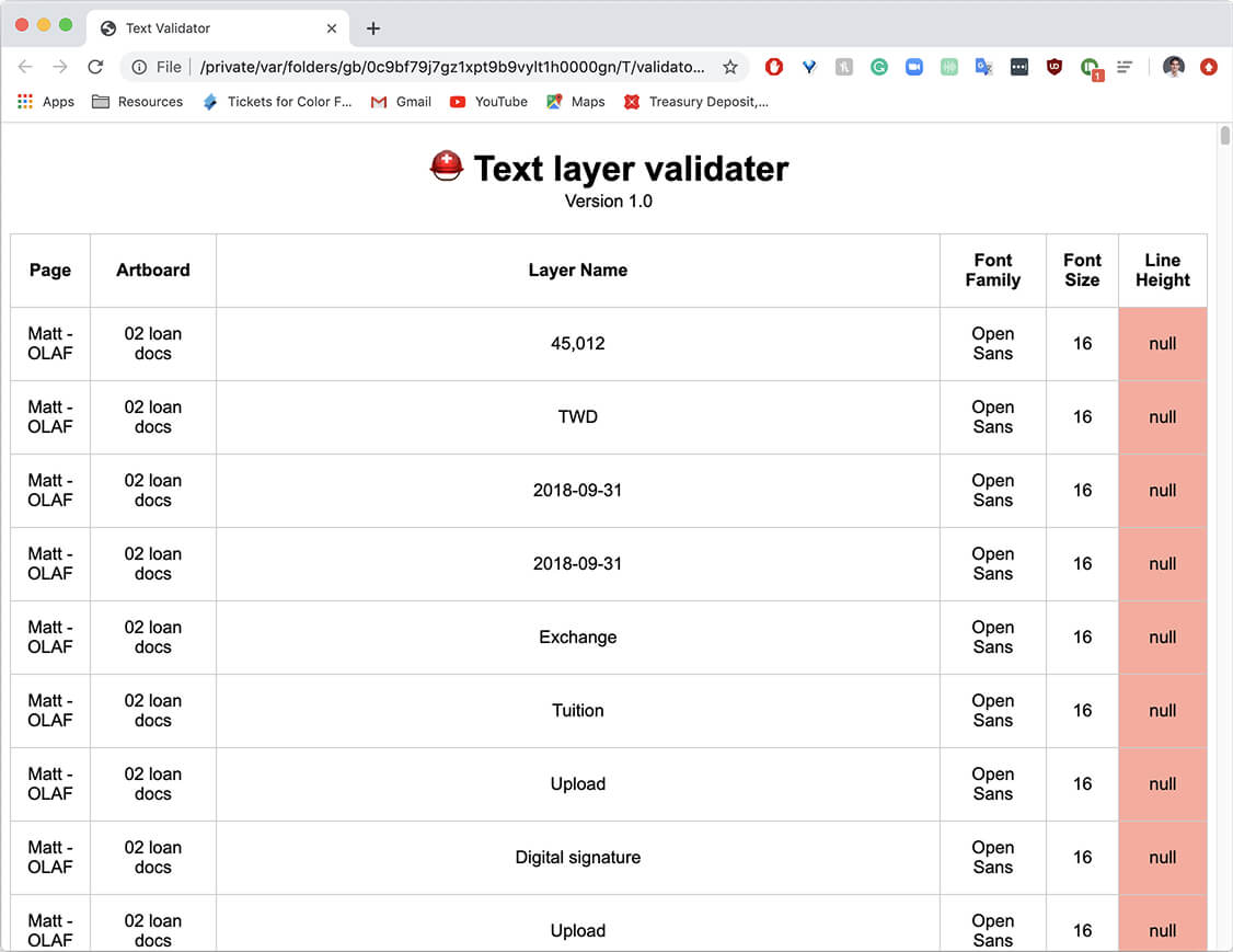
At the time, when I joined DBS bank the team was still using Sketch with Abstract and Zeplin. Remember that workflow? yuck! Anyways, during that short period before we moved to Figma, I built a simple plugin that would look at every layer and analyze the font's, their sizes, and other factors to validate before hand-off. The plan was to expand this to colors, but as we migrated to Figma, this idea slowly fell off the pipeline. Check out the repository on github.
